
Images
Images help you create a rich visual experience that lets visitors get up close and personal with your content.
Images in your CMS asset library only appear in your guide after you attach them to a piece of content, like an Item or Exhibition.

In This Article
To speed up your image upload process, save all files to a single folder on your desktop or shared drive. You can upload images in bulk by dragging and dropping files from the folder directly into the Images page in the CMS—just remember to update the image display and add alt text.
Image fields
- Image: A PNG or JPG file.
- Upload images at the highest resolution available. Images are resized for delivery in the app. Recommended minimum resolution is 72DPI with at least 720 pixels on the longest side of the image.
- Alt text (alternative text): Translate an image’s purpose, context, and key visual information into words. Alt text does not appear as text in your guide, but is read out loud by a screen reader to improve or replace the experience of seeing the image in context. For more, see Image alt text.
-
Caption: At a minimum, identify the content of the image and meet your organization’s legal requirements (e.g., Paul Manship, Celestial Sphere, 1934). You can also provide context to draw the connection between this image and other guide content. When you tap an image to make it full-screen, the caption appears below the image. The caption appears everywhere the image is used in your guide. For more, see Image captions.
Note: If you leave the caption field blank, the CMS automatically generates a caption with key information about the image's associated content. This only applies the first time you associate an image with content. Depending on the type of content, automatically generated captions vary:
- Items: Creator/Maker, Title in italics, Creation Date/Period/Era
- Botanical Items: Common Name, Scientific Name in italics
- Exhibitions, Tours, Events: Title
- Allow use in Bloomberg Connects social media: Indicate whether Bloomberg Connects can use this image on Bloomberg Connects social media channels. Posts will be shared with you for awareness before going live and will be credited, where possible, based on information provided in the CMS. For more, see Social media.
Image display formats
There are three image display formats in the app: thumbnail, hero, and full screen.

- Thumbnail: The square image that appears in the context of the map, in the list of Items included in an Exhibition or Tour, or in the related content section.
- Dimensions: 315 x 315 pixels
- Hero: The rectangular, landscape image that appears at the top of a content screen.
- Dimensions: 1280 x 720 pixels
- Full screen: The image that appears when a user taps the hero or thumbnail.
- Retains the aspect ratio of the original image. Very large images are resized to a maximum resolution of 4 megapixels.
Update image display defaults
On the About page, you can choose whether the images in your guide fill or fit the thumbnail and hero display formats by default. Learn about difference between fill and fit.
This setting affects all new images added to your guide, but you can always adjust the display for individual images. Whenever possible, images should fill the display formats for the most visually appealing guide.

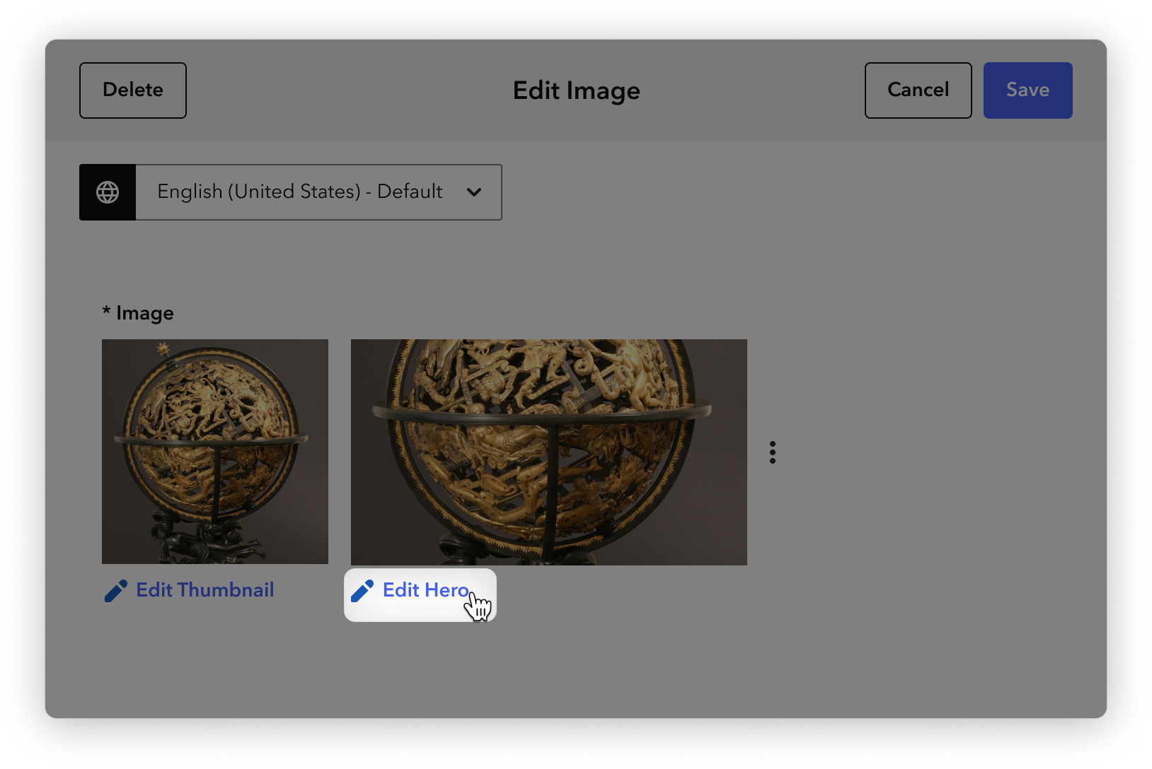
Edit an image display
You can reframe the portion of an image that appears in the thumbnail and hero display formats.
Steps
-
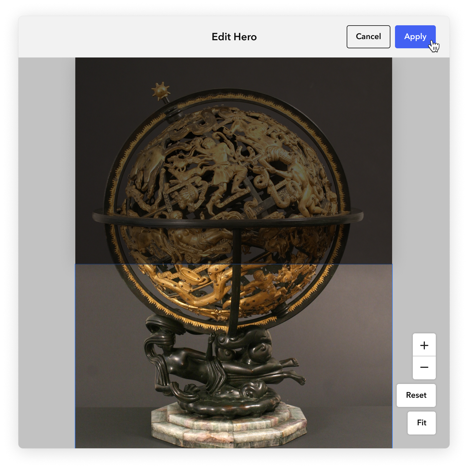
Under the image display previews, click Edit Thumbnail or Edit Hero.
In the Edit Hero or Edit Thumbnail form that appears, adjust the selection area, then click Apply to preview the changes.
- Drag the selection area until the desired portion of the image appears in frame
- To zoom in, click +
- To zoom out, click -
- To return the image to the last-saved size, click Reset
-
To remove all zooming and fit the image inside the bounds of the display area, click Fit
-
At the top of the image form, click Save.
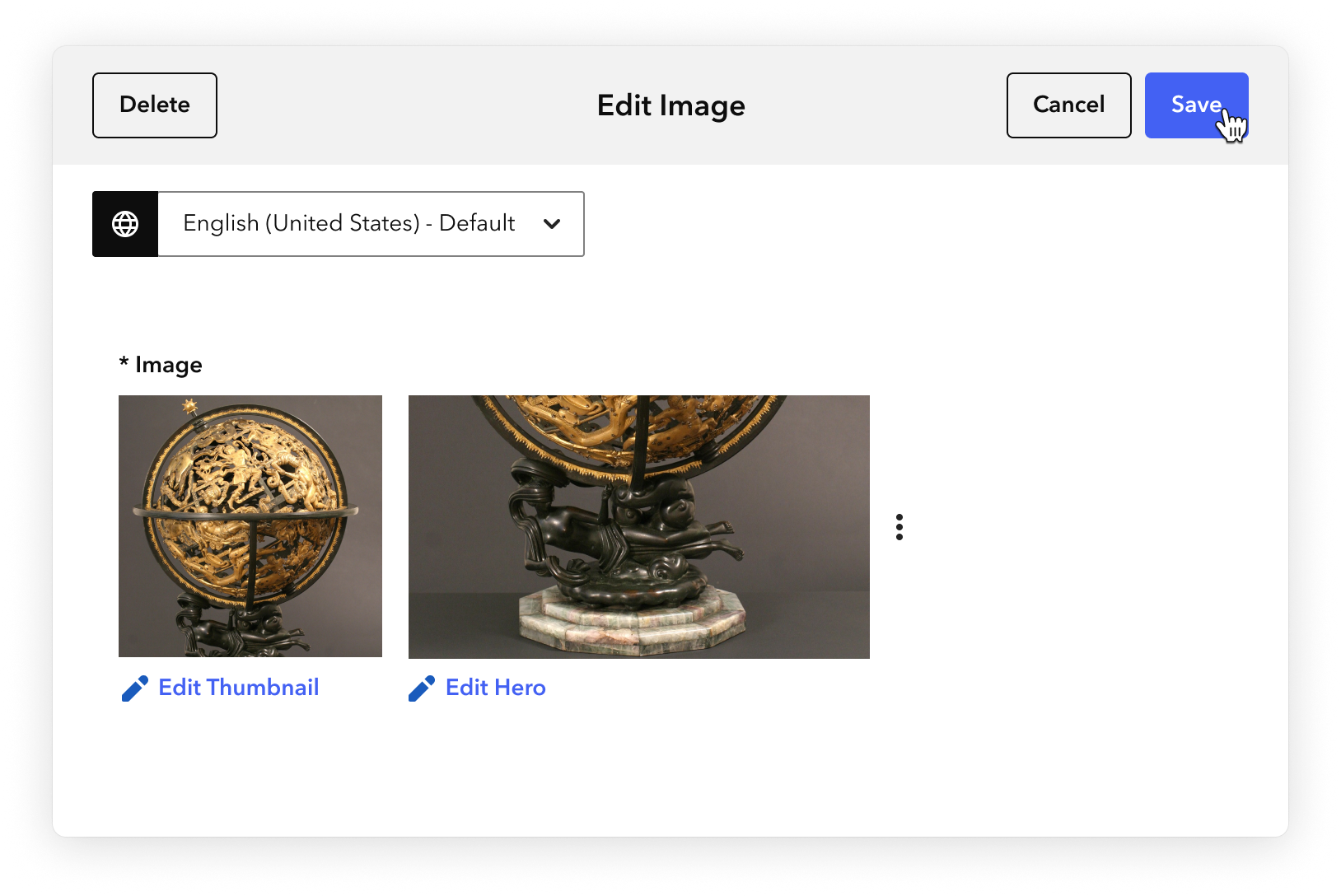
Your image display formatting saves. In your guide, the full size image appears when a visitor taps the hero display.


Content recommendations
Items, Events, Tours, and Exhibitions always have associated images. The following recommendations will help you use images effectively.
General
- For artwork and botanical Items, choose quality images that accurately depict a work of art, object, or plant in its entirety. These can be supplemented by additional images that show details or alternate angles.
- When possible, add multiple images for three-dimensional objects on view. This helps off-site visitors (or anyone who is not able to move fully around an object, whether because of mobility issues or display location) get a better sense of the items.
- Though images in your content library can be added to multiple pieces of content, avoid using the same image to illustrate multiple Items.
- Alt-text for all images is ideal.
Image captions
- Images of artworks should always have captions, and other images should almost always have captions.
- Remember that images can be attached to multiple pieces of content, so keep in mind the kinds of information necessary when an image is potentially shown without the associated Item fields. For example, artist name, artwork title, and date are included in Item information, but should also be included in an image caption to properly identify an artwork if that image is used to illustrate an Exhibition.
- Always keep copyright information in mind and consult with your organization’s copyright expert, as available.
- When a single artwork or object is shown in an installation photograph, that artwork’s information should be provided in addition to the exhibition name. When multiple artworks or objects are shown, exhibition information may be sufficient, depending on copyright.
For more suggestions and style guides, see Image captions.