
CMS overview
The Bloomberg Connects content management system (CMS) is a tool for organizing the content you want to include in your digital guide. Your guide has the potential to help visitors better understand and enjoy art, culture, and history.
This article explains different parts of the CMS. For an introduction to the Bloomberg Connects app, see App overview.

Content and assets
Content
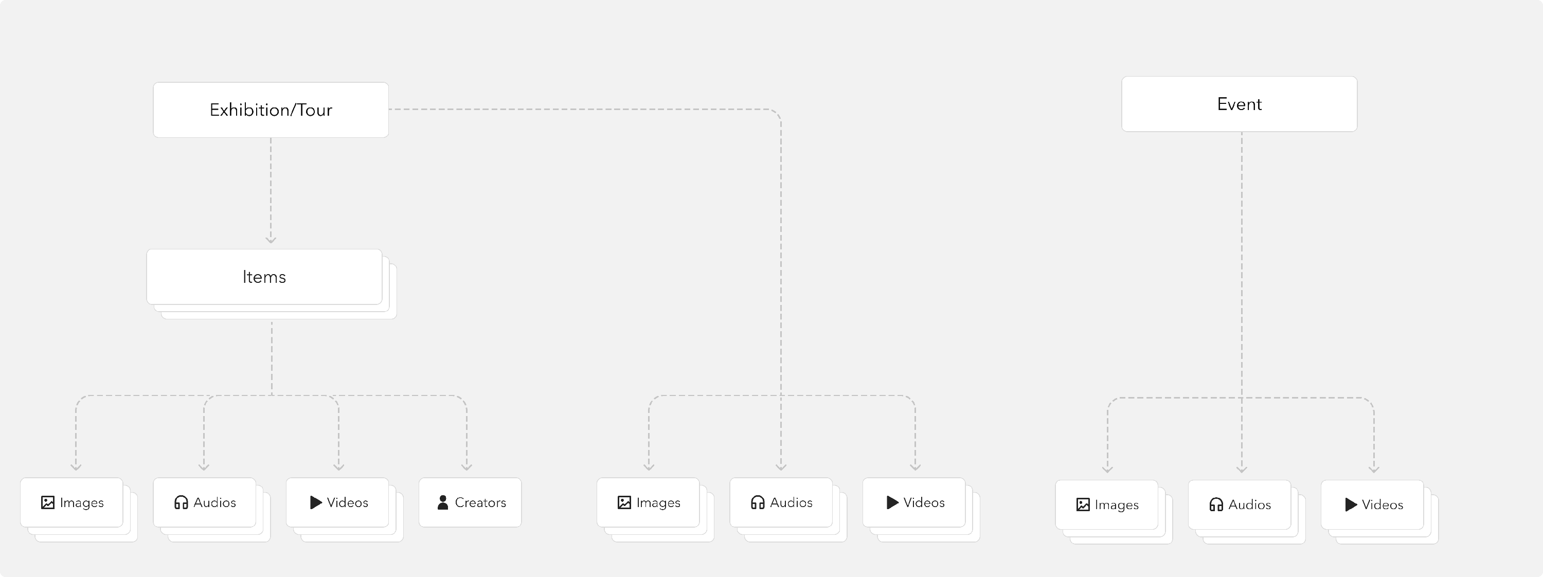
Content in your guide can be represented by templates:
- Items (and Botanical Items) are individual objects or pages. Common "items" include a painting, architectural feature of a building, or an organization's "Welcome" page.
- Exhibitions are groups of items that can be experienced in any order. Examples include artworks within an exhibition, a cluster of plants in a botanic garden, or a series of instructional pages (e.g., "Getting Involved").
- Tours are groups of items (stops) that should be experienced in a linear order. Tours are great for highlights from your collection, a guided nature walk, or linear stories that unfold one stop at a time.
- Events are experiences that take place at a specific date and time. You can use events to represent special performances, talks and readings, or community gatherings.
Each of these templates displays as a page in your guide.
Assets
Assets are the pieces of media that you can add to a content template. Assets only appear in your guide when they're attached to a piece of content.
- Audio, video, and image files enrich your guide. With more media files, you can illustrate and explain artwork, provide behind-the-scenes audio or video from creators, or record voices from your community to add fresh perspectives.
- Creators are a special type of asset that represent the people responsible for creating the objects in your guide. Creators can be artists, filmmakers, composers, and more.
The diagram below illustrates the relationship between content and assets.
Content discoverability
After you create Items, Events, Exhibitions, and Tours, you can add them to your guide.
Visitors find content in your guide in a few different ways:
- When a visitor knows what they're looking for, they can search to pull up the relevant content. For more, see Keyword search.
- Starting in your guide, visitors browse the home screen and map to find content that looks interesting. For example, a visitor interested in seeing a particular Exhibition finds a section labelled "Current Exhibitions" on your home screen, taps to see the details, then explores that Exhibition's Items and related content. For more, see Home screen and Introduction to maps.
- Starting in person at your organization (or on your website), visitors follow a lookup number, QR code, or link to open specific content in your guide. For example, a visitor standing in front of a painting scans the QR code on a nearby wall label to open the Item that represents the painting, and listens to the associated audio clip. For more, see Onsite discoverability.
The structure of your guide can help visitors understand and enjoy what you offer. A fundamental component of your guide structure is your home screen.
Home screen structure
Your guide's home screen is the first thing visitors see when they open your guide. You can think of it as your landing page or table of contents.
The home screen is made up of multiple sections. Each section can contain one or more pieces of content.
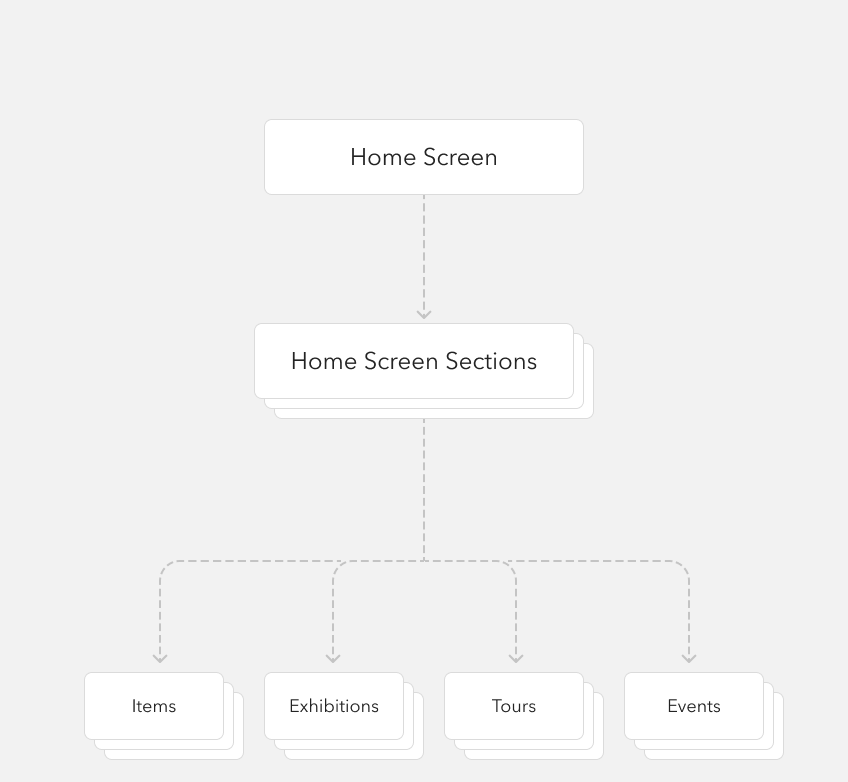
While the sections you choose are specific to your organization's needs and strategy, it's common for a guide's home screen to have these basic sections:
- On View
- Audio Tours
- Upcoming
- Plan Your Visit, or Get Involved
Within each section, you can add your content. For more, see Home screen.
Tour of the CMS
Navigation bar
From the navigation bar, you can open your content library, upload media assets, review analytics, and access other workflow tools. The navigation bar is made up of five sections.

- Content: Present content in your digital guide by using one of these templates to showcase your collection's objects and organization details. Each piece of content is represented as a page in your guide. For more, see Content templates.
- Assets: Upload media assets to attach to your Items, Exhibitions, Tours, and Events. These are files that support your content, rather than content itself. For example, a photograph in your collection is represented as an Item with an Image, not just an Image.
- Guide: Add your logos, location and hours, and other key details about your organization. Configure how your guide looks in the app by updating your home screen and map. For more, see Organization details, Home screen, and Introduction to maps.
- Reports: Review data to understand how visitors are using your guide, so you can make informed decisions about future content. For more, see Data dashboard.
- Tools: Access features to help you review your guide's content. For more, see Guide export and Accessibility suggestions.
Toolbar
The toolbar contains controls that let you preview your content while you work.

- Guide name: When you get started, you'll see a "Private" label next to your guide's name. This is a reminder that your guide isn't available to the public. The label goes away after launch.
- Guide preview: Open your guide in a new browser tab to review changes while you work. The preview shows all drafts and published content together.
Content forms
Each type of content is like a template for displaying information in your guide. The following example shows the Item template, but the same principles apply to any content template.

- Add: Open a new form to create an Item, Exhibition, Event, or Tour.
- Content management actions: Save your updates as a draft, publish your changes so they appear in your guide, or cancel your progress. If you've already saved and/or published a piece of content, you'll see other actions, like delete and unpublish. For more, see Manage drafts and published content.
-
Language switcher: To provide human-translated content in a language other than your guide’s default language, choose the language here. For more, see Multilingual content.
Note: Your translations always override Google Translate. When no human translations are provided, visitors who are using a phone in a different language automatically see translations provided by Google Translate.
- Required fields: All templates have some required fields, indicated by asterisks. Usually, these fields include images (or media files) and title/name. This information ensures that your guide is visually appealing and contains the most basic information visitors need to know.
- Optional fields: All templates include some optional fields. Add as much detail as you like. Generally, the more detail you can provide, the better. All information you provide is available to visitors when they access this content in the app.